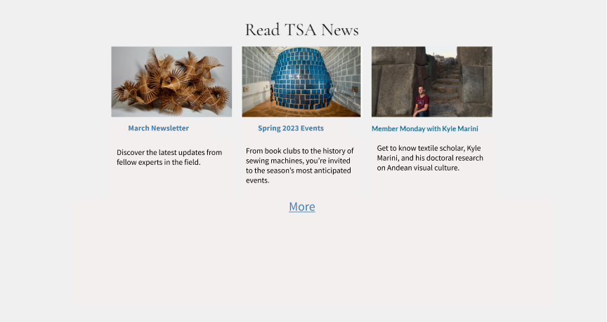
From this…
And this…
UX Writing
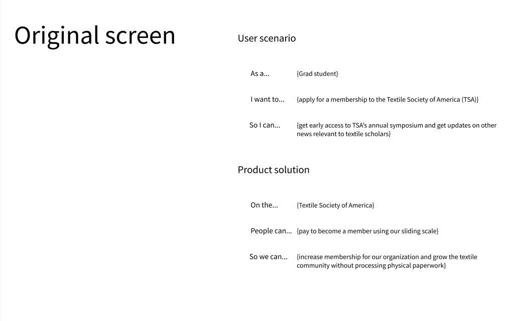
I took a UX copywriting course through the University of Washington. While I worked on several assignments throughout the course, one of my favorites focused on voice.
The assignment:
Choose a website and create a voice that reflects the site’s personality and meets the needs of both the organization and the user.
The user:
My theoretical user was a grad student looking to join the TSA.
So.
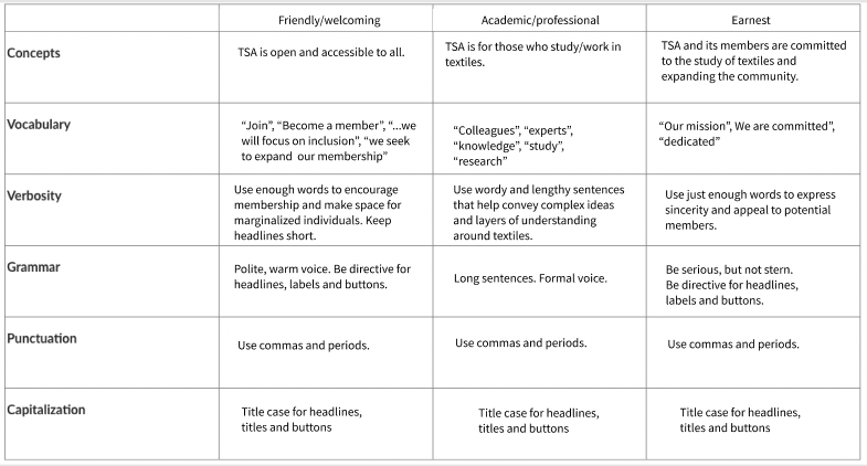
I created a UX voice chart that allowed us to keep some of that academic copy while making room for warmer, more welcoming language.
There were also plenty of opportunities to trim. I proposed that we cut copy, especially in areas where the TSA was attempting to encourage membership.
The website:
I chose the Textile Society of America (TSA), a nonprofit and global network that connects scholars, curators, and other professionals who work in textiles.
The result?
A friendlier, less wordy homepage.
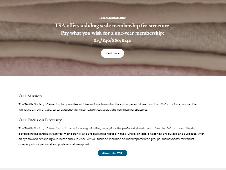
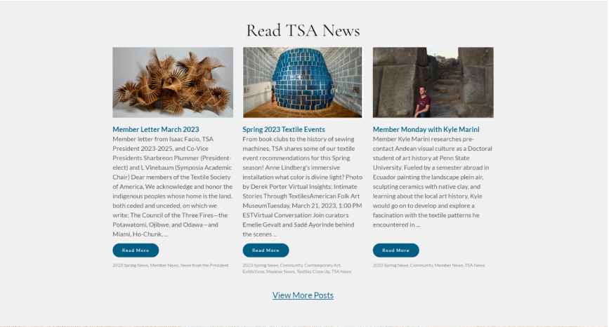
TSA had a lot to work with – its homepage copy was extensive and offered the user tons of info about the organization.
But…
..it was a little too verbose. Not to mention, stiff.
…to this.
…to this.
…to this.
Check out the Figma to see the total transformation.
